What do you do when you’re home for the week and you haven’t brought your laptop with you? You scour your family computer for the hideous, cringe-worthy graphics you created when you were a thirteen year old! If you haven’t seen the post that started it all, click here.
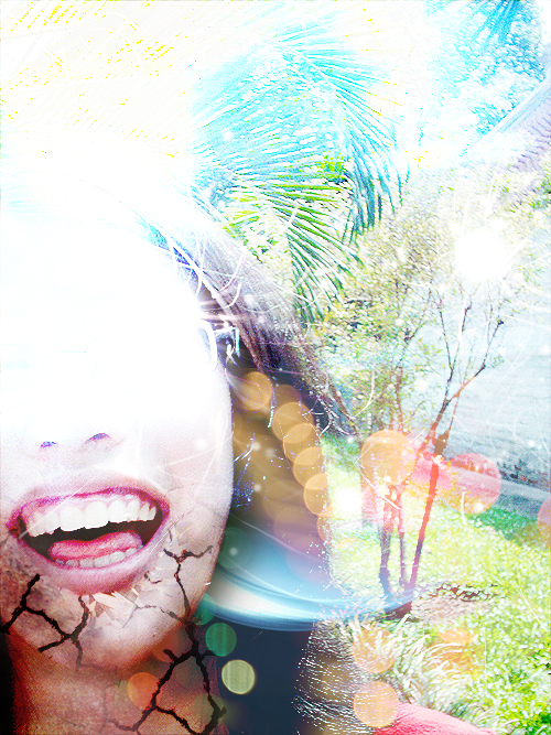
This is a shoddy photo manipulation of my sister Jenny. It’s pretty over-saturated and there are too many conflicting textures used. Jenny has great teeth though 😀

I’ve probably been through this countless times – I was pretty much obsessed with Amy Lee. This is a website header I made for one of my old websites. It’s not bad actually! I hate the green though! Remember when pixel fonts were a thing?
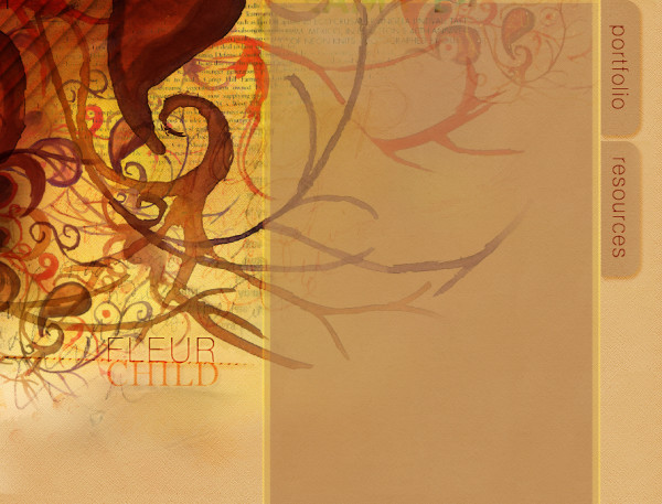
This shocked one me! It’s actually nice! I fondly remember carefully planning out this header image and making a huge mess with the watercolour paints.

This is some kind of Christmas card I made for school. This one isn’t too shabby either, but there is too much burnt cardboard going on. So much Catholic guilt going on here LOL.

This was a fake banner I made for Shoppers Drug Mart in class. Sorta looks like something you would see on their recyclable bags! There is too much green and there needs to be more contrast. The apple looks like it’s been soaked in a shiton of kryptonite!

Awww it’s my bro! This one isn’t ugly at all! He’s so little here :3 I need to get back into photography!

AHHHH I’m going to cry now. This is Rocky, the friendliest, most loyal, food-loving beagle in the world! He passed away on April’s Fools this year. I miss you a lot!
As you can tell, these graphics are a lot more better than the ones I posted in original “Ugly Design” post. This just means I have to dig deeper to find the scum of my prepubescent graphic design phase! Challenge accepted!
Related Posts:
Handling the haters
An exercise in empathy
I am not exceptional, please stop thinking that