What is Twitter Bootstrap? It has nothing to do with the Twitter site and its trillions of tweets (have they reached that point yet?). It does have to do with the Twitter developers and their goal to make the web development process more “intuitive”, and ultimately uniform. Moreover, it’s a framework of HTML/CSS templates, Javascript extensions, and other useful interface features. We all seen that popular design with many greys, drop-shadows here and there, clean gradients, and Helvetica/Arial. Well that’s Twitter Bootstrap! Huge companies and start-ups alike use this framework. It is also the most popular project on GitHub.
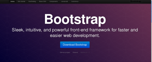
Here is the base template for an index page. A lot of sites out there follow this design.
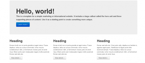
From heading titles to accordion navigation, Bootstrap provides all of the pre-made tags for the many features a well-constructed site needs. Rather than spending time and money designing custom user interface, companies can implement Bootstrap and achieve its clean yet modern feel.
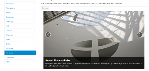
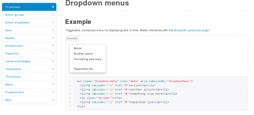
There’s even a responsive design feature for viewing websites on smaller resolutions like phones and tablet.
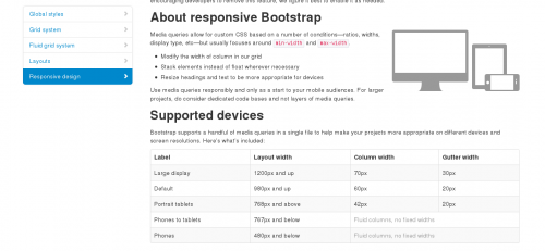
Quite impressive? Truth be told, I just learned of Bootstrap’s existence a week ago at work. The UI/UX developers were debating whether to ditch their own user interface framework for this one. The most prominent viewpoint from that discussion was that Bootstrap’s interface was too “generic” looking. For companies that have distinctive branding, it is better to design in-house. But it doesn’t hurt to borrow features from Bootstrap. Since it is a framework that is used on countless websites, people will be very accustomed to it. Similar to the argument that it is better to keep some of the user interface of the mobile operating system when designing applications, this argument can also be made.
As for whether I would use Bootstrap in my own design? I’ll borrow snippets here and there, but I will definitely not be switching to the entire framework and ditching all my CSS. My site isn’t huge and does not have a high traffic of daily visitors. Plus, I’d like to think my site is on the more artsy site. I try create more “out-of-the-box” design with my interface. I will, however, use their design more in my development projects. That would definitely be something worth trying! Twitter Bootstrap for start-ups and larger companies it makes sense. Even then, I would think writing your own code would be more easier to manage for developers. You don’t want all websites out there to eventually resemble Bootstrap. Well obviously you can modify elements, even then, you can only go so far.
Related Posts:
Developing for Culture
Spring Cleaning
Torn between design and code