I was recently helping my sister, Jenny, in her applications to universities in the UK. One of her extracurricular activities was participating in a website design competition called Thinkquest (which I had no idea until now was hosted by Oracle). She had first participated in the competition in 2006, and that happened to be the peak of my website-building days. Well, more like my abuse-as-many-CSS-properities as possible days. So like any good sister, I helped her in creating the site. So after all these years this site is still online! The other day Jenny sent me url and boy, I was in for a good laugh.
I mean, just look with your own eyes:
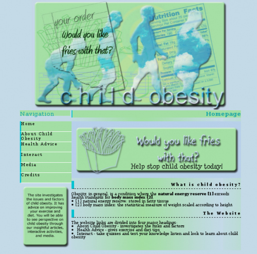
The colours, the default Photoshop style filters for text… Dayummmm son, I can’t believe I took part in this eye sore!
After this blast from the past, I started thinking to myself: Wait, this isn’t so bad. I’ve created even tackier stuff!. So here is a compilation of the most hideous images and text placed on top of one another:
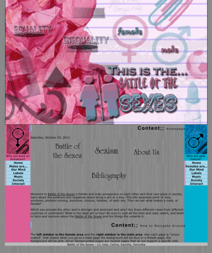
I had also participated in Thinkquest many moons ago. Our team created a site analysing gender equality and perception. The content was actually pretty decent – we conducted surveys and wrote pretty insightful articles for 13 year olds. By the way, the header image is a really dodgy and grainy gif animation.
If you don’t know me well, I used to be really fanatic about a band called Evanescence.
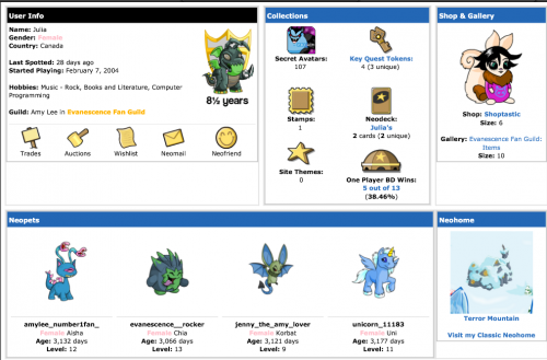
If you couldn’t tell by the names of my neopets.
I still keep up with their music and attend concerts, but you know, in a less *~OMG I LUVS THIS BAND~* kinda way. I had started my web design interests on Neopets. On the site, you can create fan clubs called “guilds”.
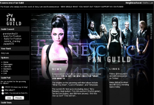
Ok so, this is the most recent layout, so it’s actually decent looking.
This gives prepubescent kids the opportunity to write less than stellar markup and create hideous, eye gauging image edits. My second guild, Evanescence Fan Guild, was relatively successful. There were over 500 members at one point and thousands of forum posts about Amy Lee LOL. Once I ran out of space on the guild page, I decided to expand it elsewhere. I had dabbled in shitastic free hosting sites like Tripod, Angelfire, and Geocities before, so this time I decided to go with Freewebs. Back in the day, it was actually pretty good for freeware hosting. Remember those message boxes, cbox? Just terrible.
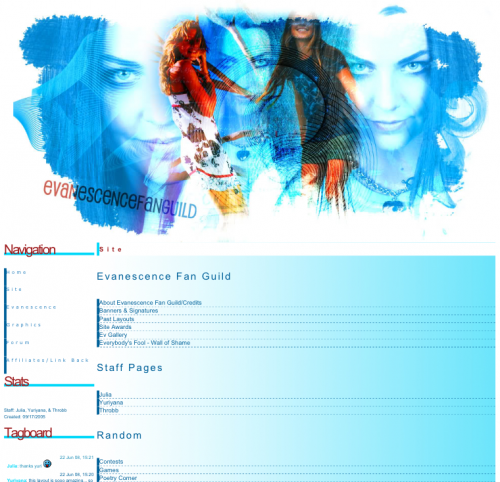
The header image isn’t too bad, this was made at a time when my Photoshop skills were starting to improve for the better. The CSS is another story. As you can tell, I enjoyed robbing the innocence of border properties.
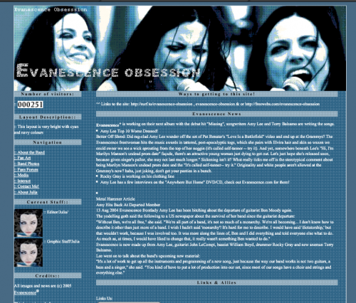
Even before that, I had attempted to create an Evanescence fan site called “Evanescence Obsession”. Yeah, that site name defines my major interests between 2004 to 2009. Here, I was try to capture the oh-so-trendy grungy look. But really, all I got was a pixelated mess of Amy Lees. This was before I figured out you could just torrent Photoshop and merely accepted the dreadful fate that was Paint. I also really only knew how to code 2-column layouts, using of course nasty tables. I also loved to display counter boxes so I could flaunt my many non-unique visitors haha.
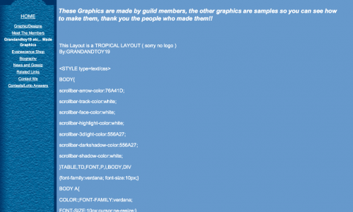
My first guild on Neopets, back in 2002/2003 was called “Rock On Punk Centre”. Yeah, it just got even more humiliating! It was some terrible guild where we talked about Good Charlotte and Blink 182. That was a time when I was first dabbling with HTML and CSS. Like my other guilds, I wanted to expand this one off Neopets. I got the most ghetto free-hosting from a site called Tripod. It was so terrible. There were so many ads and useless Bravenet plugins (ok, plugins is too good of word to use in this case). So behold, this ugly mess. Even then, I would provide free layouts for people. I would copy and paste sketchy-ass code onto the page (this was when I was not aware of the textarea tag).
Well, I did have to start somewhere haha. Maybe one day I’ll look back on what I’m doing now and cringe? We’ll just see about that XD
Related Posts:
Handling the haters
An exercise in empathy
I am not exceptional, please stop thinking that